Downloads available below; just click the arrow below each logo.
INTRODUCTION
Delta is committed to making flying better. True to that commitment, we must be diligent in all efforts of brand representation and communication. The Delta identity is a seal of approval and a promise of industry-leading products and services delivered by 80,000 passionate and determined Delta people.
The basics
- Only use one of the four approved color versions of the logo.
- Do not alternate, rotate, modify or add content to the logo.
- Follow the clear space guidance in this document.
- Do not use outdated logos unless there is a direct reference to Delta history justifying use.
- Delta’s full company name should always be written as three separate words... Delta Air Lines.
OVERVIEW
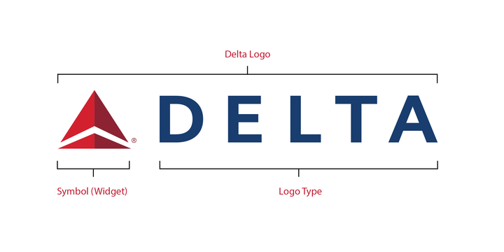
Our logo is the simplest, most immediate and most recognizable representation of the Delta brand. It builds upon our heritage, while communicating with a confident, modern and renewed energy that represents our future. The all-red symbol and all-uppercase logotype speak with an honest, respectful and direct language that embodies our core positioning.
LEGAL PROTECTION
If, after reading the instructions provided below, you are uncertain as to when or how a trademark designation should be used, do not hesitate to contact us.
All Delta trademarks should always be designated with one of the following symbols:
® |
SM |
TM |
|---|---|---|
|
For service marks which have been granted registration by the U.S. Patent and Trademark Office, use the ® symbol. As a general rule, the ® symbol should be used on the first or most prominent usage of the registered mark in copy. However, this requirement can be satisfied by the use of a logo which includes the ® symbol. For example, if a document includes the Delta Signature, it would not be necessary to also use Delta® or SkyTeam® the first time these terms appear in text. In long documents, occasional use of the ® symbol will reinforce the importance and proprietary nature of the trademark to the reader. The ® symbol should be placed immediately after the trademark – not after descriptive names. Examples: DO NOT |
For service marks which have not yet been granted registration by the U.S. Patent and Trademark Office, use the SM symbol. As a general rule, the SM symbol should be used on the first or most prominent usage of the registered mark in copy. However, this requirement can be satisfied by the use of a logo which includes the SM symbol. In long documents, occasional use of the SM symbol will reinforce the importance and proprietary nature of the trademark to the reader. Example: DO NOT |
For trade marks which have not yet been granted registration by the U.S. Patent and Trademark Office, use the TM symbol. As a general rule, the TM symbol should be used on the first or most prominent usage of the registered mark in copy. However, this requirement can be satisfied by the use of a logo which includes the TM symbol. In long documents, occasional use of the TM symbol will reinforce the importance and proprietary nature of the trademark to the reader. The TM symbol should be placed immediately after Example: DO NOT |
COLOR VARIATIONS
Use the Delta logo as the primary brand expression in publications.
The integrity of the signature must be respected at all times. Don’t stretch, condense or otherwise abstract it. Any modification of the logo confuses its meaning and diminishes its impact.
Note: There is no reversed color logo. Always reverse to white.
Full-Color Logo
One-Color Delta Blue Logo
Reverse Logo (It's there, right below this text. It's white.)
One-Color Delta Black Logo
BACKGROUND CONTRAST
Use the full-color logo when the background color value is between 0% and 30% after conversion to gray scale.
Do not place the logo on a background when the color value is between 30% and 50% after conversion to gray scale.
Use the reversed logo when the background color value is between 50% and 100% after conversion to gray scale.
CLEAR SPACE AND MINIMUM SIZE
The Delta logo is one of the company’s most precious assets. Always position it for maximum impact and give it plenty of room to “breathe.” This will ensure the logo’s presence and legibility.
Clear space frames the logo, separating it from other elements such as headlines, text, imagery and the outside edges of printed materials.
Clear Space
A minimum amount of clear space must surround the logo at all times. This space is equal to the cap-height of the Delta logotype (e.g., the “L” in DELTA ).
In general, a larger amount of visually uninterrupted space should be kept clear for optimal visibility.
Minimum Size
When reproducing the logo, be conscious of its size and legibility. To ensure quality reproduction in print, the signature must appear no smaller than 8p in width.
PLACEMENT
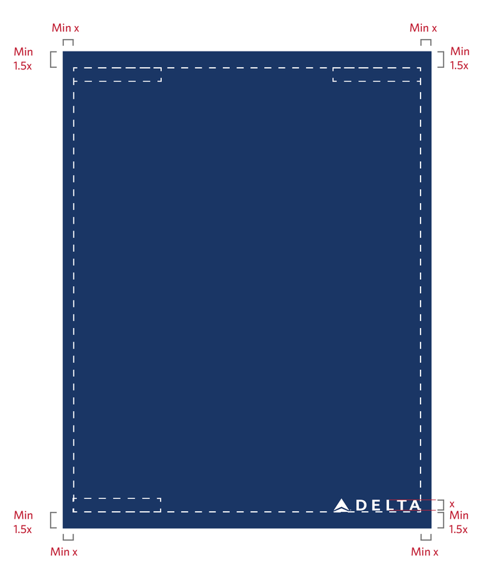
The Delta logo must always be placed to the left or right margins of any given application. The logo can be placed top right, top left, bottom right or bottom left.
The minimum space for margins demonstrated must always be observed when placing the logo. “x” is equal to cap-height of the Delta logotype (e.g., the “L” in Delta), and is the minimum amount of space required left and right of the logo.
A larger amount of space (1.5x minimum) should always be placed to the top or bottom of the logo whenever possible.
Note: The Delta logo should be scaled in size to most appropriately address specific communication and application needs.
COLOR PALETTE
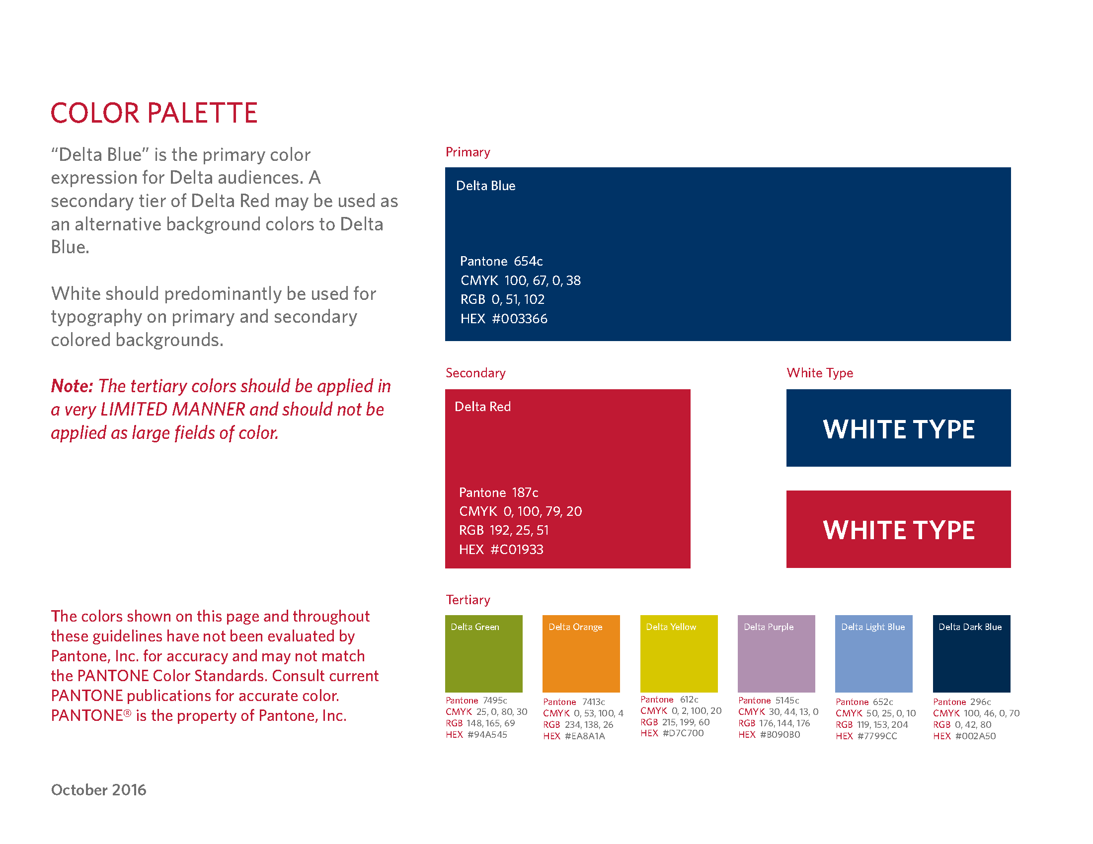
“Delta Blue” is the primary color expression for Delta audiences. A secondary tier of Delta Red may be used as an alternative background colors to Delta Blue.
White should predominantly be used for typography on primary and secondary colored backgrounds.
Note: The tertiary colors should be applied in a very LIMITED MANNER and should not be applied as large fields of color.
The colors shown on this page and throughout these guidelines have not been evaluated by Pantone, Inc. for accuracy and may not match the PANTONE Color Standards. Consult current PANTONE publications for accurate color. PANTONE® is the property of Pantone, Inc.
DO NOTS
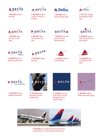
We encourage you to become familiar with the correct use of the Delta logo. Please note that the new Delta brand expression does not permit use of the previous versions of the logo.
The integrity of the logo must be respected at all times. Don’t stretch, condense or otherwise morph or manipulate it. Any modification of the logo confuses its meaning and diminishes its impact.
FURTHER ASSISTANCE
For more information or guidance on the proper usage of Delta’s logos and imagery for media professionals, please contact Delta Corporate Communications:


